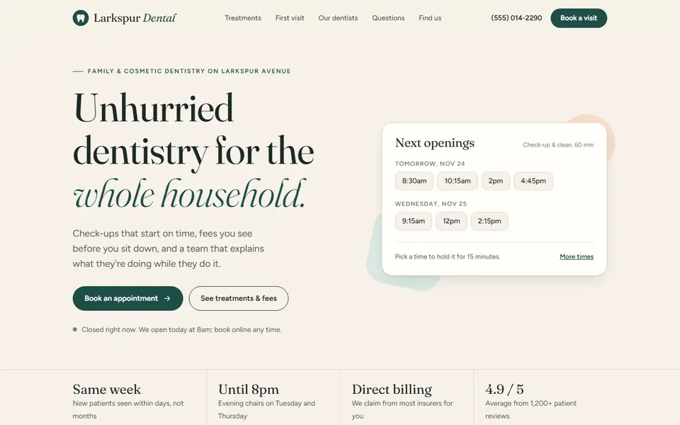
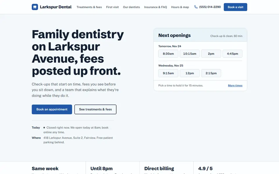
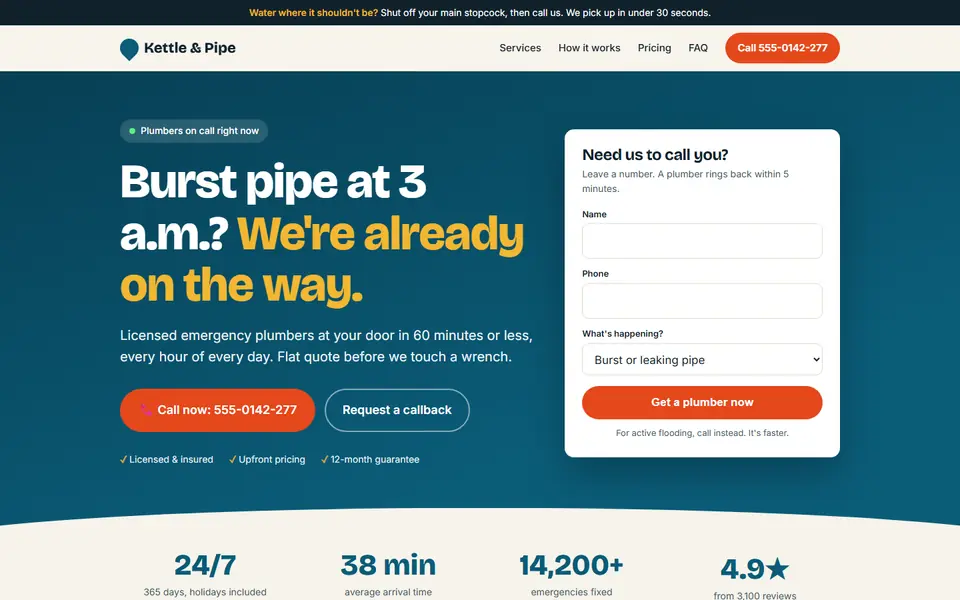
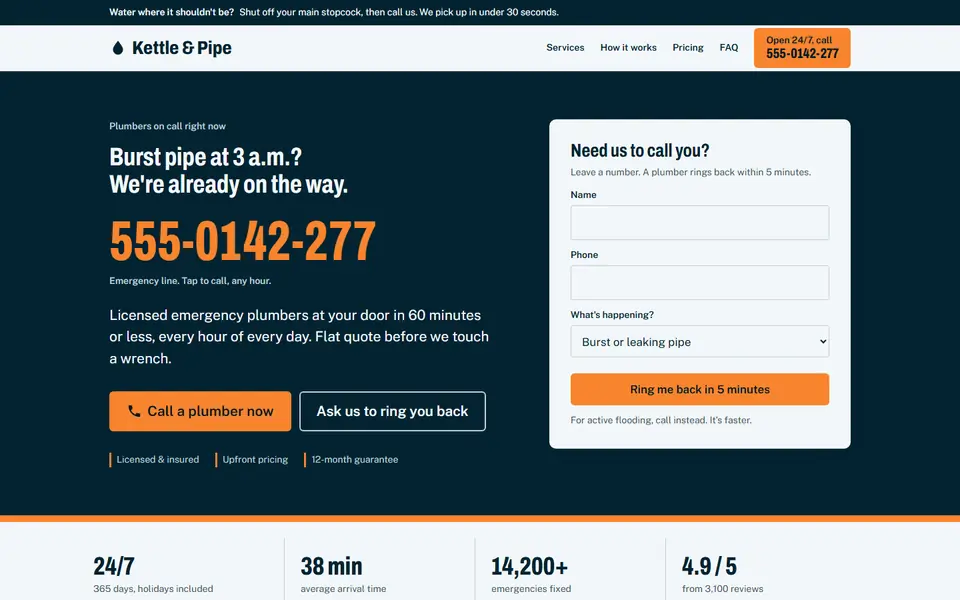
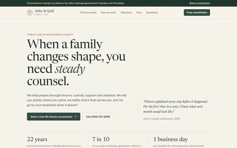
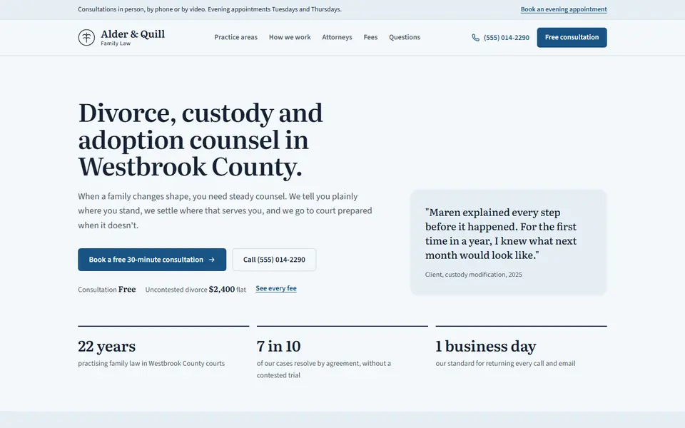
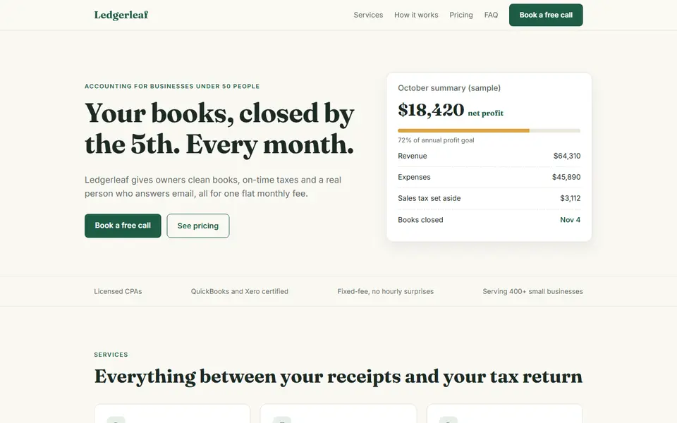
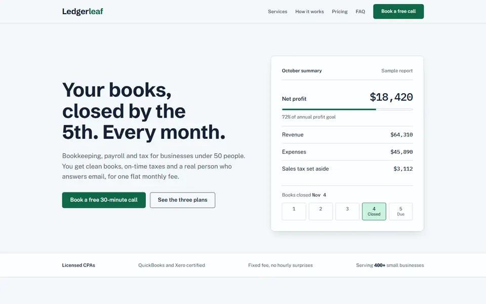
slopbench s09, wedding photography: 31 tells before, 0 after
Featured run: the widest set of gains with no measured number getting worse.
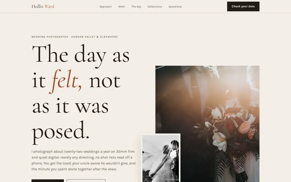
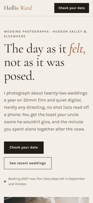
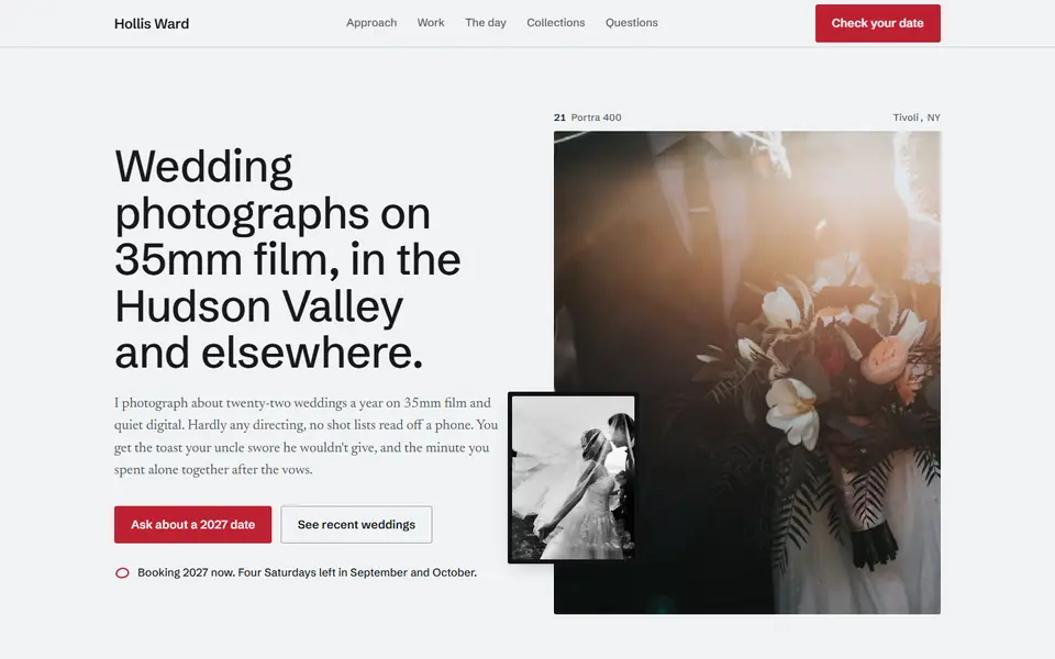
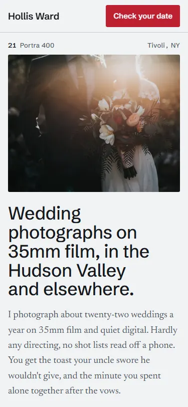
Generated by claude-opus-5-5 from “Build a landing page for a wedding photography business.” Re-themed by restyle; both versions audited the same way.
- AI tells
- 31 → 0high 2 → 0, second-order 2 → 0
- Lighthouse performance
- 98 → 99mobile
- Lighthouse accessibility
- 95 → 100
- axe serious + critical
- 0 → 0
- Contrast failures
- 0 → 0body text
- Distinctiveness
- 0.72 → 0.93reads as its niche 0.84 → 0.96
- Blinded judge
- 2 of 2orderings preferred after, confidence 2 of 3
What the audit found on the original
-
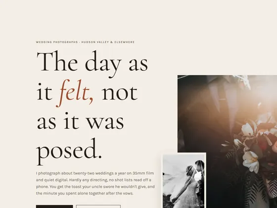
high
restyle/second-order/cream-serif-terracottaonbodyCream page, serif headings and a terracotta/clay/apricot accent: the look models default to when told to avoid purple gradients.
Fix: Move the page off warm cream: pick a background, display face and accent from your competitors' research, not the model's default.
-

high
restyle/second-order/broadsheet-hairlinesonbody > headerSquare corners on every box, hairline rules between sections and serif or condensed display type: the default 'editorial' costume.
Fix: Give cards, buttons and images a real radius and drop most hairline rules; let spacing separate sections.
-

medium
restyle/copy/duplicate-link-textonbody > header > div > a:nth-of-type(2)"Check your date" is used as link text 3 times, so the links are indistinguishable out of context.
Fix: Give each link text that says where it goes, so no two links read the same.
-
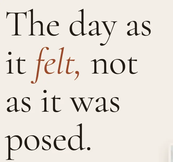
medium
impeccable/italic-serif-displayonh1Italic serif display headline: italic serif h1 (cormorant garamond) at 121px "The day as it felt, not as it was posed."
Fix: Set headings upright in a display face that fits the category; drop the italic serif default.